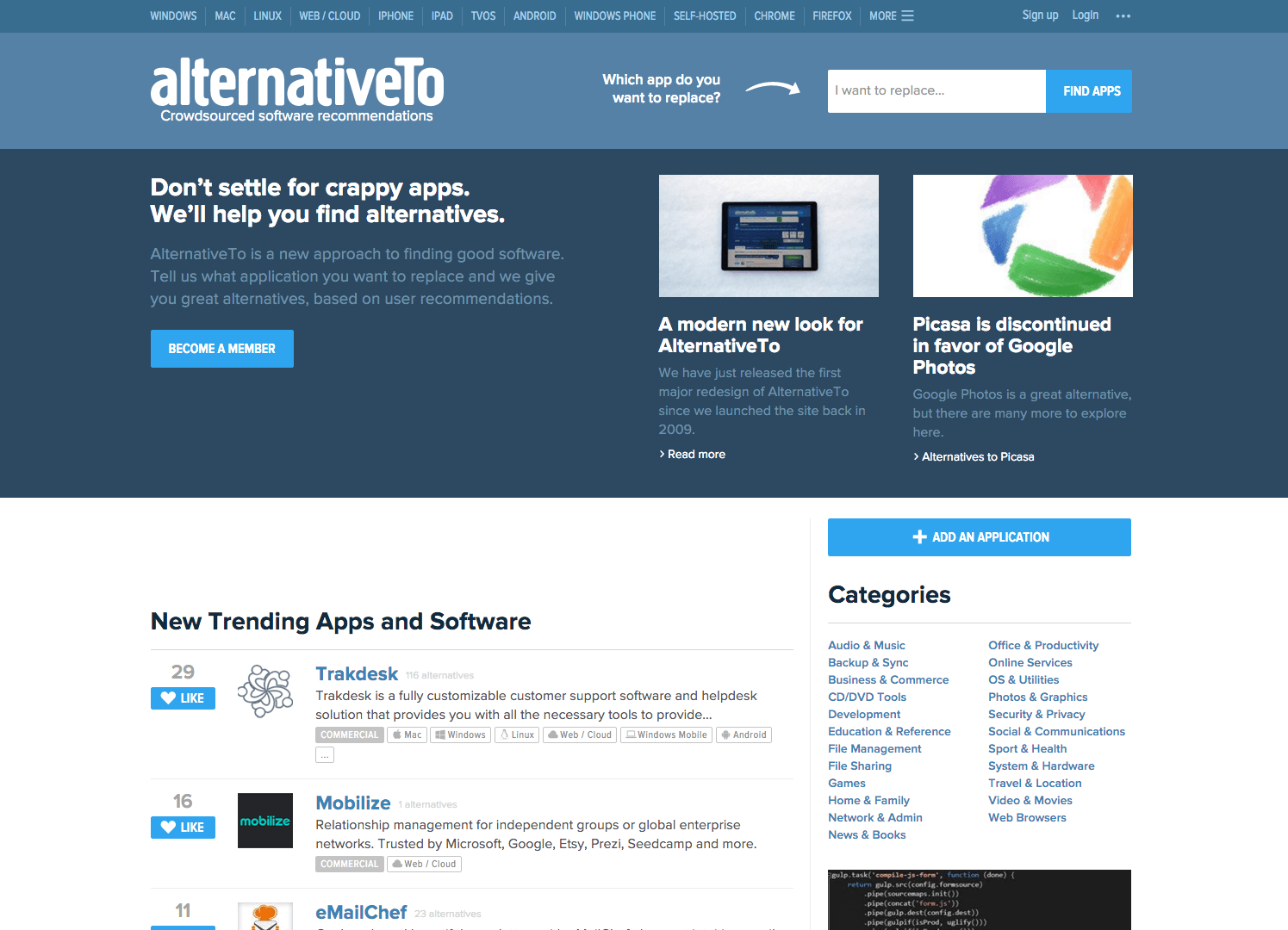
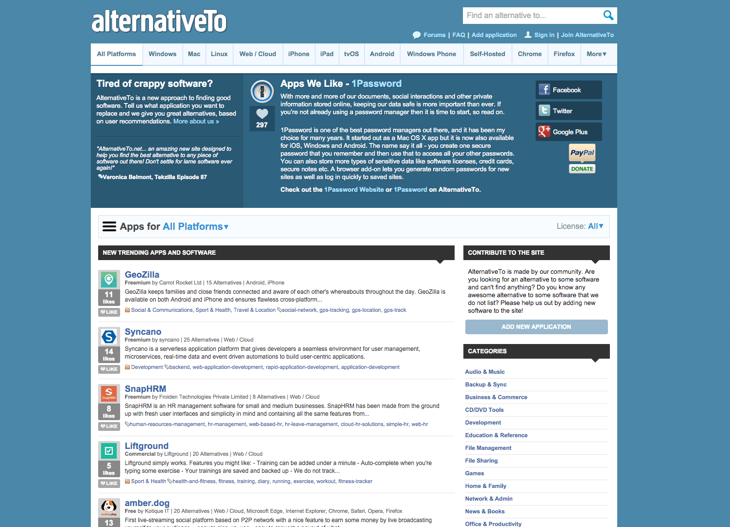
I know Alternativeto.net for many years now and keep using it for finding alternatives for any kind of applications. Since the launch in 2009 the design was never changed too much. Now the team behind Alternativeto relaunched the site with a new and fresh design.


The details for the Alternativeto.net relaunch
The team also published a blog post about the new design and talked about what’s new:
- The site is now fully responsive and does not force the users to switch to a separate mobile version on their smartphones
- They moved from Helvetica / Arial to Proxima Nova as their main font.
- The front page got a complete overhaul with a new layout, most of the elements were also made bigger.
If you want to know what the team is using to build the site you can take a look at this official list.
